UX/UI Case Study · TheKabadiwala · 2025
Making Recycling Fun
A full-scale redesign of India's largest scrap collection app. Solving real drop-off crises, false bookings, user confusion and building a gamified system that made recycling engaging, rewarding and impactful.

19.4%

Drop-off Rate After Redesign

98%

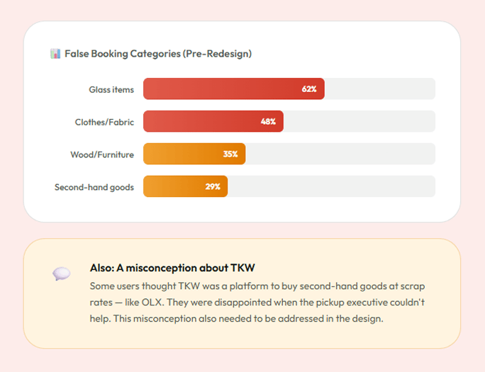
False Bookings Eliminated
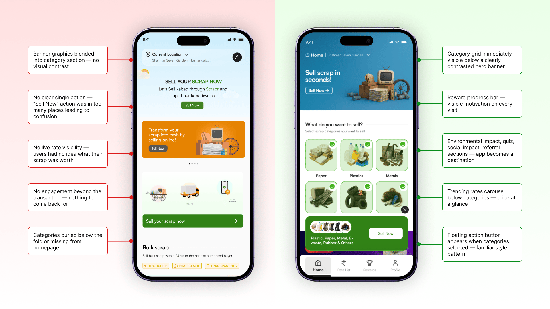
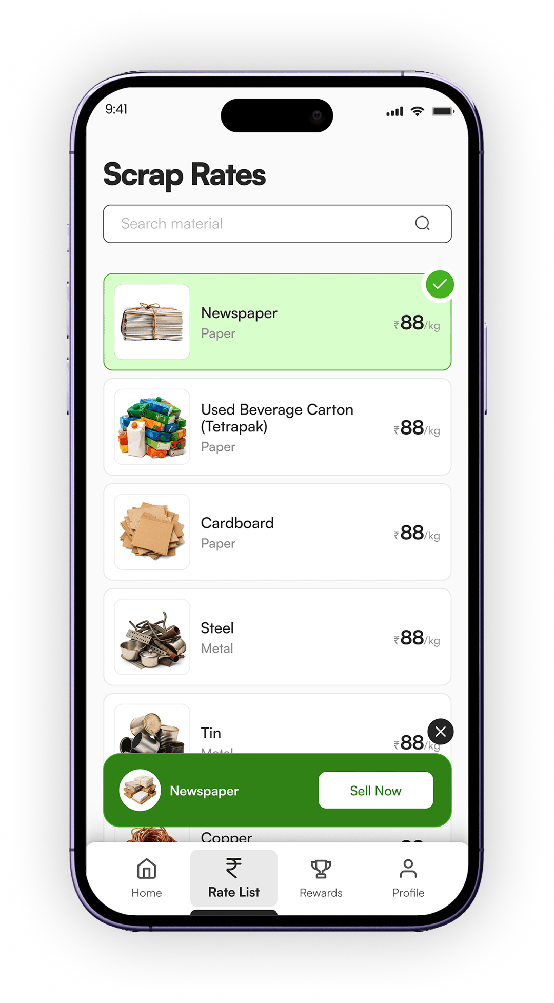
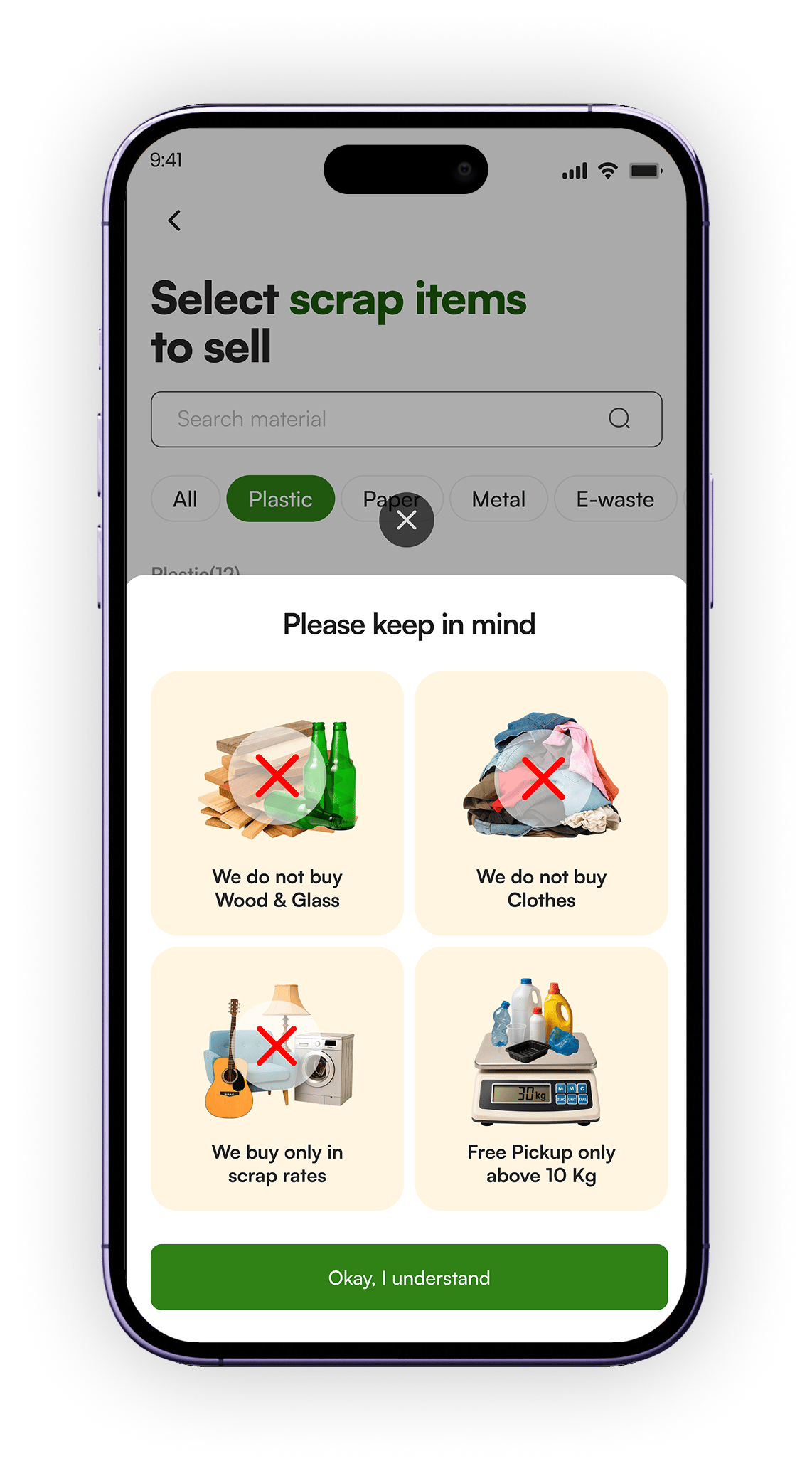
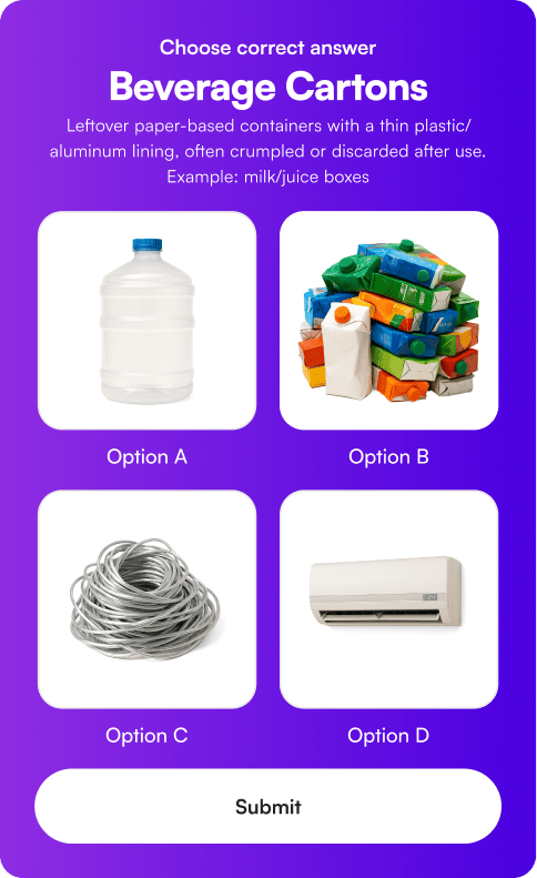
7

UX Scenarios Solved

19.4%

Drop-off Rate After Redesign

Setting the scene
What is TheKabadiwala?
TheKabadiwala is India's scrap collection platform. Users schedule home pickups for recyclable waste like paper, plastic, metal, e-waste, rubber and earn money for it. The app connects urban households with trained kabadi or Scrap Collectors, making recycling simple, fair, and financially rewarding.
I was brought on as the designer responsible for the complete UX and UI redesign. The brief came from the stakeholders that the newer version of the app was causing a surge in drop-offs, fewer bookings, user confusion, and serious operational headaches.
The challenge wasn't just visual, it was structural. The redesign had inadvertently stripped out the very things that made the original app work. My job was to understand why, rebuild smarter, and layer in new features that would make TKW not just useful, but genuinely engaging.
Tight Constraints

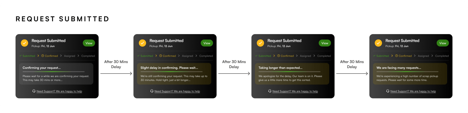
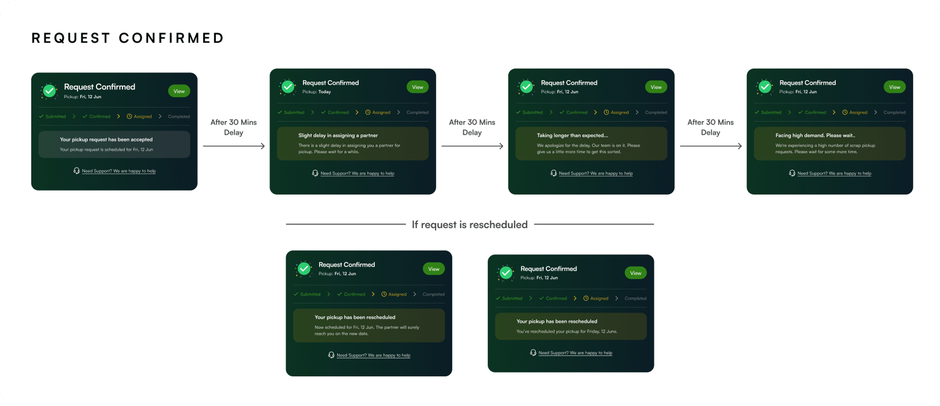
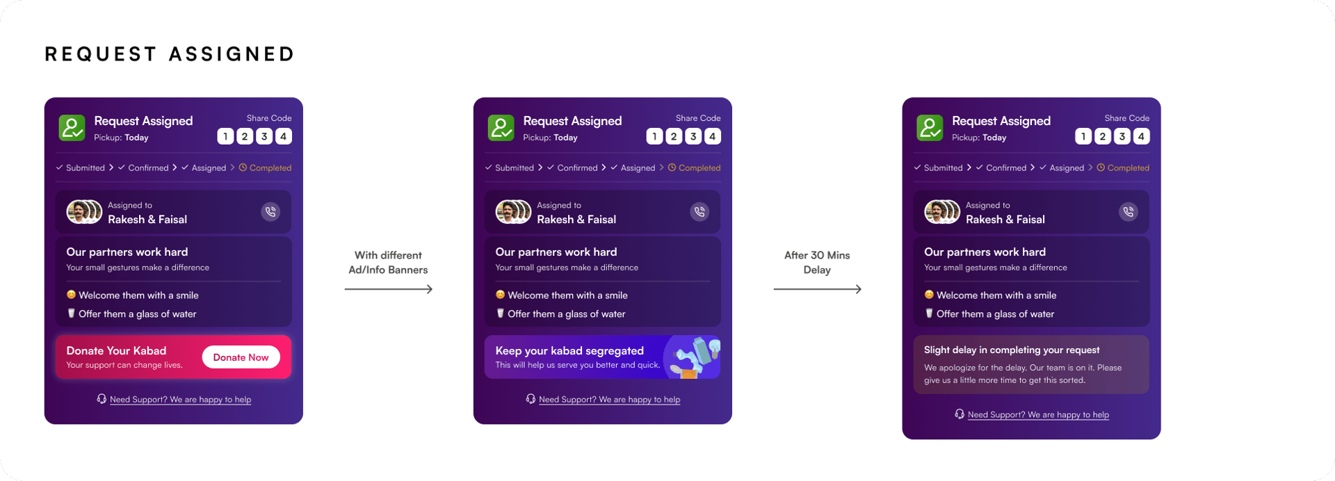
Every problem had to be solved under tight deadlines. Stakeholders needed fast turnarounds. This meant rapid research, quick decision-making, and designing solutions that were grounded in real data — not assumptions.

🎯
My Role
End-to-end UX and UI designer. I owned research synthesis, information architecture, interaction design, visual design, and handoff across all screens and flows.
👥
Stakeholders
Worked directly with the CEO and the product/ops team. All design decisions were grounded in real usage data, app store reviews, and operational pain points.
📦
Scope
Full redesign of the app: Homepage, Category & Sell Flow, Rate List, Rewards, Referrals, Environmental Impact, Donation, Status Widget, User Rating, and the entire Cypher Design System update.
Research & Discovery
Before designing,
we listened.
Under tight deadlines, structured research was still non-negotiable. Every design decision in this project is backed by at least one signal from the real world.
🔍

 UX Audit

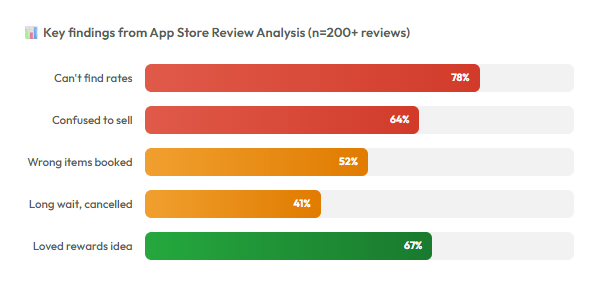
App Store Review Analysis

🎙

Stakeholder Interviews

📊

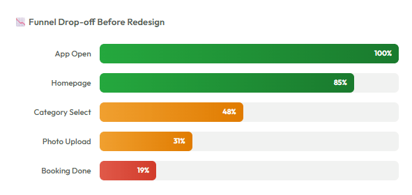
Drop-off & Funnel Data

Heuristic Evaluation

📧

Customer Support Mail Analysis

📞

Ops Team Feedback

🎯
High drop-off on the homepage
Data showed users landing on the homepage and leaving without taking any action. The redesigned UI looked polished but buried the core action ie. selling scrap.
😤
App store reviews screaming frustration
Dozens of 1–2 star reviews cited confusion about where to find material prices, how to start a booking, and what happens after scheduling.
📞
Ops team overwhelmed with wrong bookings
The customer executive team was flooded with cancellation requests for glass, wood, and clothes — materials TKW doesn't buy. The app gave no warning.
💡
Old app worked better despite weaker UI
Stakeholder interviews confirmed: the older version, while visually outdated, had category selection front and center. Users knew exactly what to do. The redesign had removed that clarity.
Scenario 01 — Homepage Drop-off
Users were lost the moment
they opened the app.
The homepage was visually cleaner, but it had quietly broken the most important thing: the path to selling scrap. Categories were no longer front and center. Users landed, got confused, and left (Hypotheses based on data and research).

"The old version was clear and upfront. This version looked better but users didn't know where to go. Data confirmed it."

Drop-off Rate
Before Redesign
58%
Drop-off Rate
After Redesign
19.4%
( 1 Month)
Scenario 02 — Finding Material Rates
Users couldn't find
what their scrap was worth.
App store reviews were filled with one question: "Where are the prices?" Users who did find rates had no clear path to start selling from there. There was a double friction of first finding the price, then figuring out how to sell it.
🔴
The Problem
Data showed users landing on the homepage and leaving without taking any action. The redesigned UI looked polished but buried the core action ie. selling scrap.
The Solution
I introduced a bottom navigation bar, a fundamental navigation pattern the existing app was completely missing. One dedicated tab for "Rate List" shows live material prices per city. From that tab, users can directly select materials and proceed to sell. Problem solved at the navigation level, not just the screen level.
Scenario 03 — False Material Bookings
A recurring crisis that cost trust on both sides.
Users regularly booked pickups for glass, wood, clothes which are the items TKW doesn't collect. Kabadi partners showed up, found wrong items, and had to cancel. The ops team was flooded. Customer satisfaction dropped. The app never warned anyone.

The Multi-layered Warning System

🚨
Layer 1: Popup at flow start
When a user begins the booking flow, a bottom sheet popup with bold graphics and clear typography appears: "We don't collect glass, wood, clothes." It's impossible to miss.
🔁
Layer 2: Reminder at each step
If a user dismisses the popup without reading, the warning appears again subtly but firmly, at the bottom of each subsequent step. Never intrusive enough to block the flow, but persistent enough to register.
🛒
Layer 3: Addressing the OLX misconception
"TKW only accepts scrap rates, we don't buy second-hand goods at resale prices." Added this clarification in the same warning system. Addressed both problems with one design pattern.

The Outcome

🎯
98%
Reduction in false/wrong material bookings after launch
Scenario 04 — Booking Delay & Cancellations
The silent wait that killed conversions.
After scheduling a pickup, users were left in the dark. No status, no ETA, no communication. The operational reality: confirmation could take up to 30 minutes or more. Users assumed something broke and cancelled hurting both metrics and operations.
🔴
The Problem
The app showed a static "Request Sent" screen after booking. No indication of what happens next, how long to wait, or whether anyone received the request. Users treated silence as failure and cancelled.

The operation itself was multi-step: User sends request → Pickup Admin receives it → They assign a pickup executive → Executive picks up, pays user, confirms booking. Each stage had natural delays — but the app showed none of this.
The Solution
I designed a Request Status Widget that lives on the homepage, replacing the category section once a booking is active. It communicates the exact stage of the request, explains any delay honestly, sets expectations on wait time, and keeps users engaged instead of anxious.
Scenario 05 — UI Redesign + Gamification
Making the app feel
alive and worth returning to.
Stakeholders wanted the app to feel fresh, fun, and aspirational. The previous design system (Cypher) had a limited palette. I introduced gradients, textures, rich graphics and a full gamification system to make TKW a destination, not just a utility.

UI Redesign Direction

🎨
From flat to textured
The old Cypher design system was flat and colour-limited. The new system introduced gradient backgrounds, illustrated 3D-style graphics, rich iconography and expressive typography — while staying clean and accessible.
Every screen redesigned
Homepage, Rate List, Rewards, Referral, Profile, Request Flow, Status Widget, Environmental Impact, Donation, Rating — every screen was rebuilt from scratch under the new design language.

The Gamification System

Three interlocking reward systems that work together to drive referrals, repeat selling, and long-term retention:
🚨
Referral Cash Reward
Cash credited after every successful first booking by referred user
🔁
Recycling Milestone Rewards
Sell more KG → unlock milestone → win a prize
🛒
Referral Milestone Rewards
Refer more users → hit milestone → win bigger prizes

Making invisible impact visible.

Selling scrap helps the environment but users never felt it. I designed an animated widget with 6 environmental scenarios. Each has 4 illustrated states that evolve from worst to legendary as users sell more scrap. The world literally gets greener with every pickup.
THE Endowment Effect

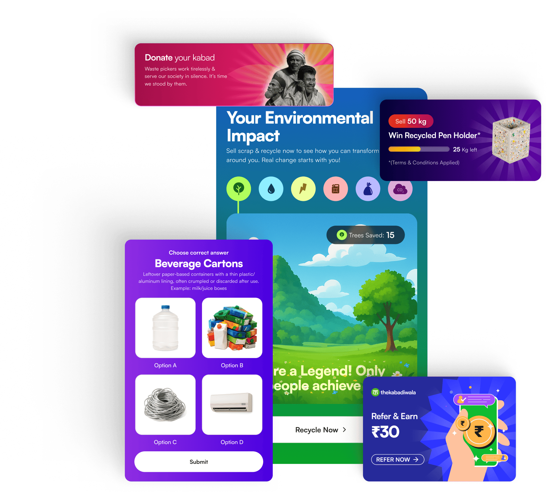
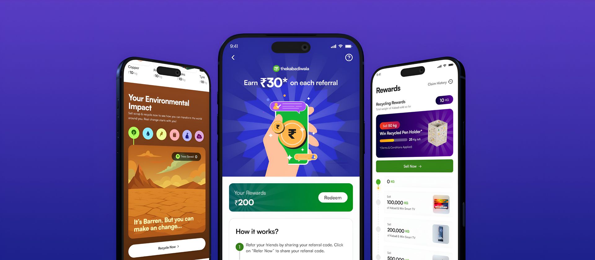
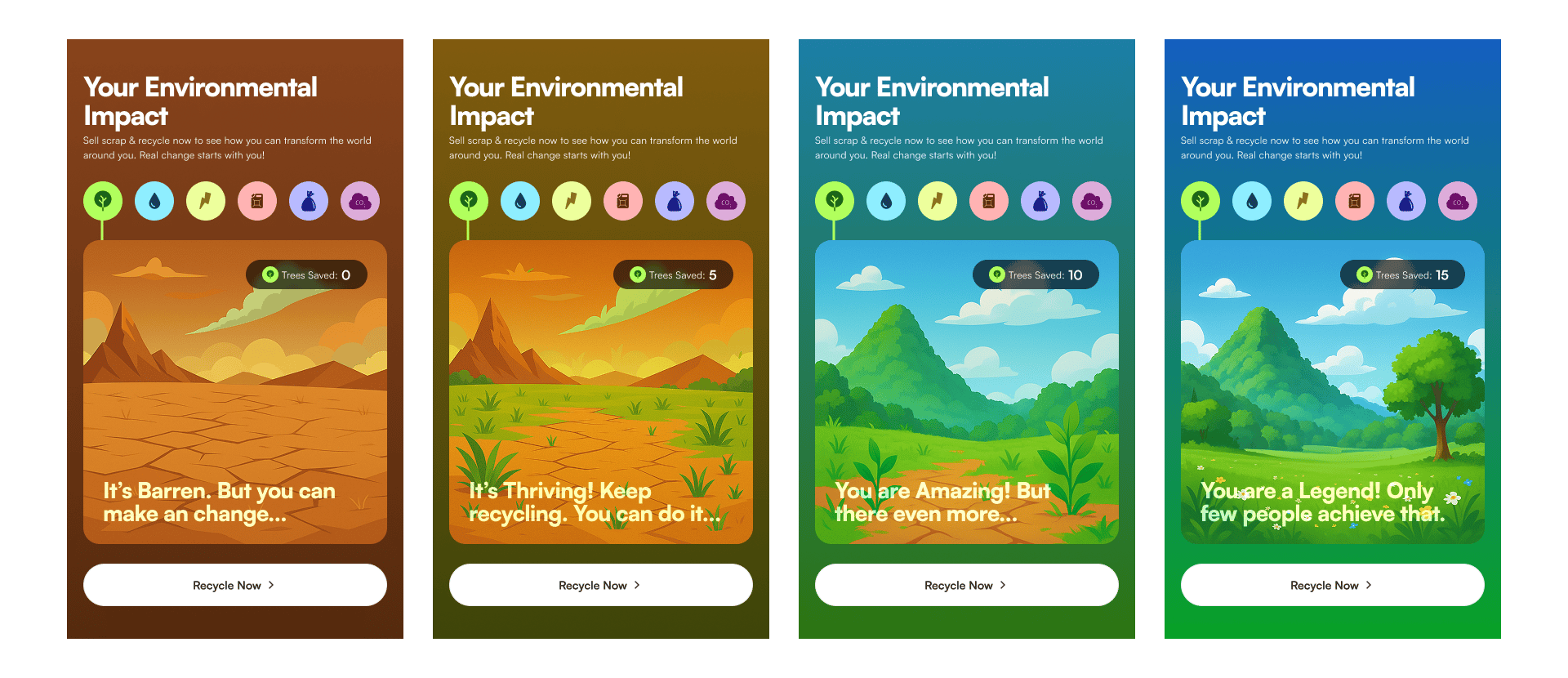
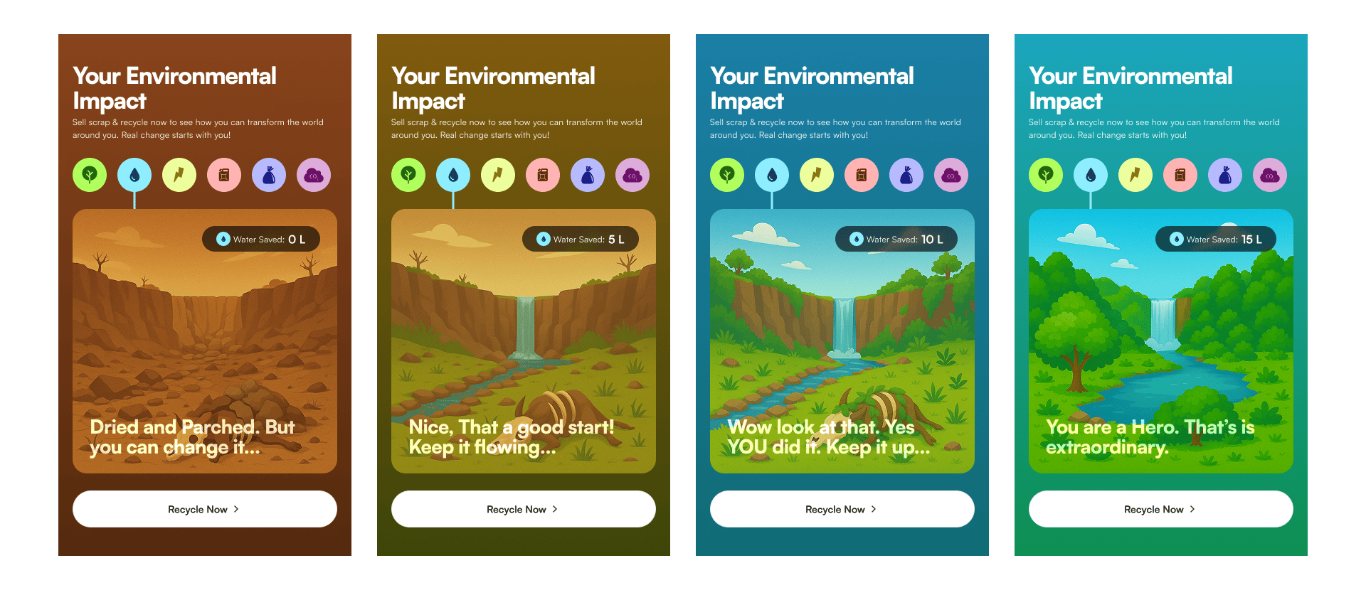
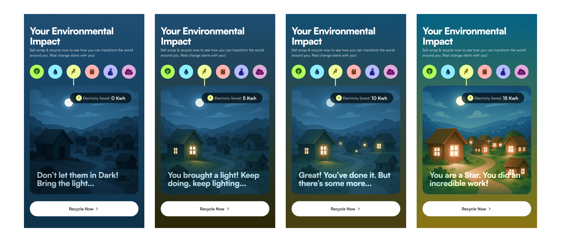
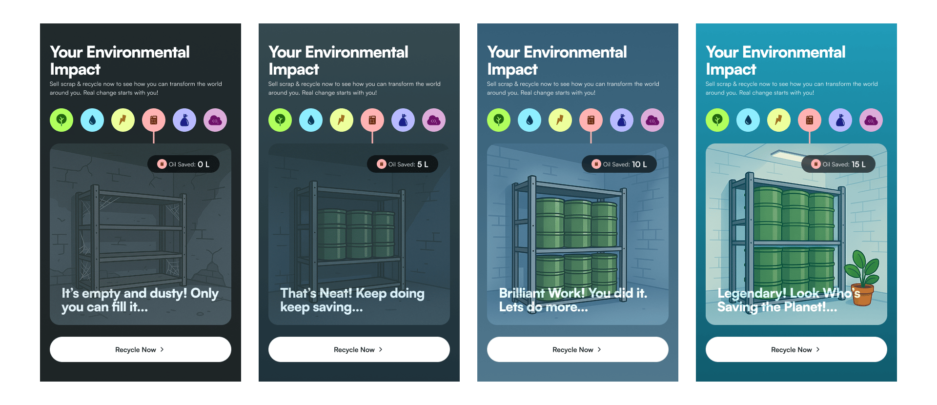
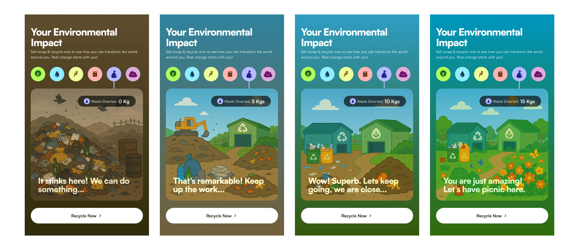
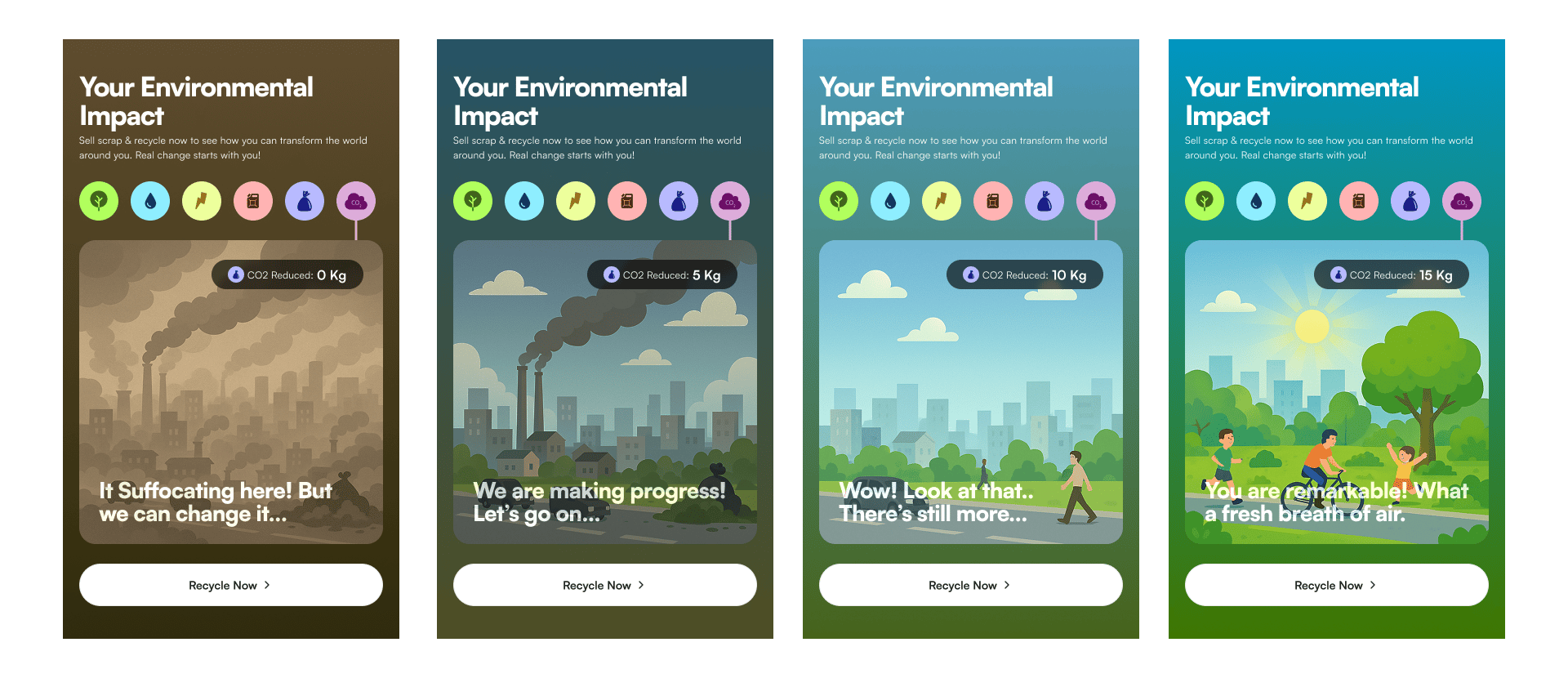
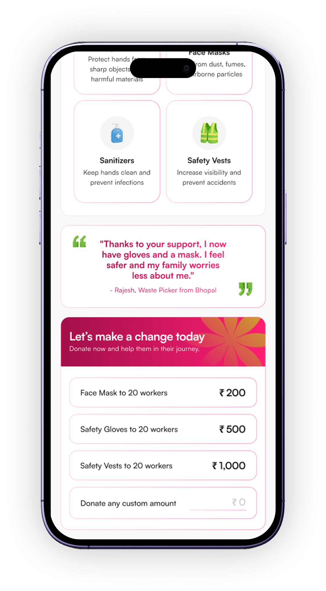
Once users see their own impact illustrated, they feel ownership and keep selling to watch their world improve.

🌳
Trees Saved
From barren desert to thriving forest. Each kg of paper recycled = a tree spared.
💧
Water Saved
Parched riverbeds filling up. Recycling saves enormous industrial water usage.
Electricity Saved
Homes going from dark to powered. Energy saved from recycling lights communities.
🛢️
Oil Saved
Dusty fields becoming vertical green farms as plastic recycling reduces oil needs.
🗑️
Landfill Diverted
From overflowing dump to city park. Every kg of scrap sold keeps waste out of landfills.
💨
CO₂ Reduced
Smoggy industrial skies clearing to blue. Recycling cuts manufacturing emissions dramatically.

Other Homepage Engagement Sections

Selling scrap helps the environment but users never felt it. I designed an animated widget with 6 environmental scenarios. Each has 4 illustrated states that evolve from worst to legendary as users sell more scrap. The world literally gets greener with every pickup.
🧠
Quick Quiz
Short interactive quizzes that teach users about their scrap categories in a fun, game-like format. Keeps users on the app longer and increases category knowledge.
🤝
Social Impact
"Sell 50 kg scrap → Support 1 waste worker's education for a month." Ties selling behaviour to tangible human impact.
Scenario 06 — Donation Feature
Your scrap.
Their safety.
Not everyone wants to pocket the cash. We designed a donation feature where users can redirect the value of their scrap, fully or partially, to provide safety equipment for waste workers. No extra payment. Deducted from their next kabad bill.

The Design Thinking

💡
Key Insight
Waste workers collect our recyclables without gloves, masks, or basic protection. TKW users interact with these workers at every pickup. The donation feature closes this loop, turning a transaction into a relationship with real human stakes.
Friction-free giving
Users don't pay anything extra. The donation is deducted from their next kabad bill. Zero new payment friction. Just a choice at checkout, keep the money or give a little.
Design Decisions

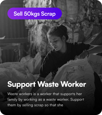
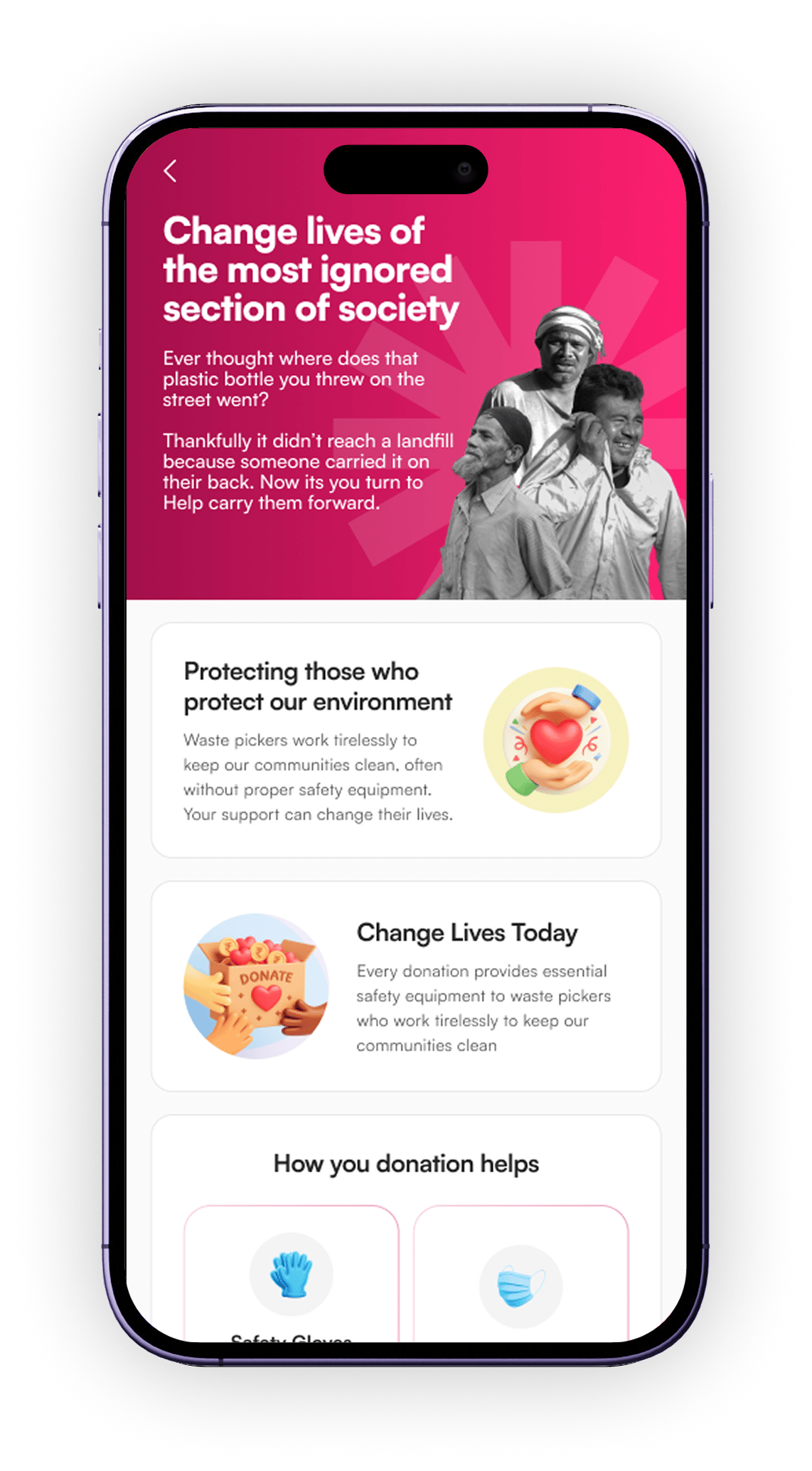
Emotional hero section: Real B&W photo of waste workers in a warm gradient frame. Immediate empathy over stock photography cheerfulness.

Concrete tiers: ₹200 = 20 masks. Tangibility drives action far better than abstract donation amounts.

Zero-friction: Deducted from bill. No payment screen. One checkbox changes the world.

Scenario 07 — User Rating System
Recycling with
respect and accountability.
Waste pickers are often treated poorly by customers, rushed, dismissed, disrespected. We wanted to shift that dynamic. By giving waste pickers the ability to rate users, we created a system of mutual accountability that rewards respectful behaviour and builds a healthier community.
🔴
The Insight
Pickup partners (kabadi workers) had no formal way to flag difficult customers. Users who gave wrong addresses, rescheduled last-minute, or behaved poorly faced no accountability. This affected partner morale and efficiency.
The Solution
After every completed pickup, pickup partners rate the user. This rating appears on the user's profile and influences how the system prioritises them for time slots and partner assignments.
Reciprocity Effect

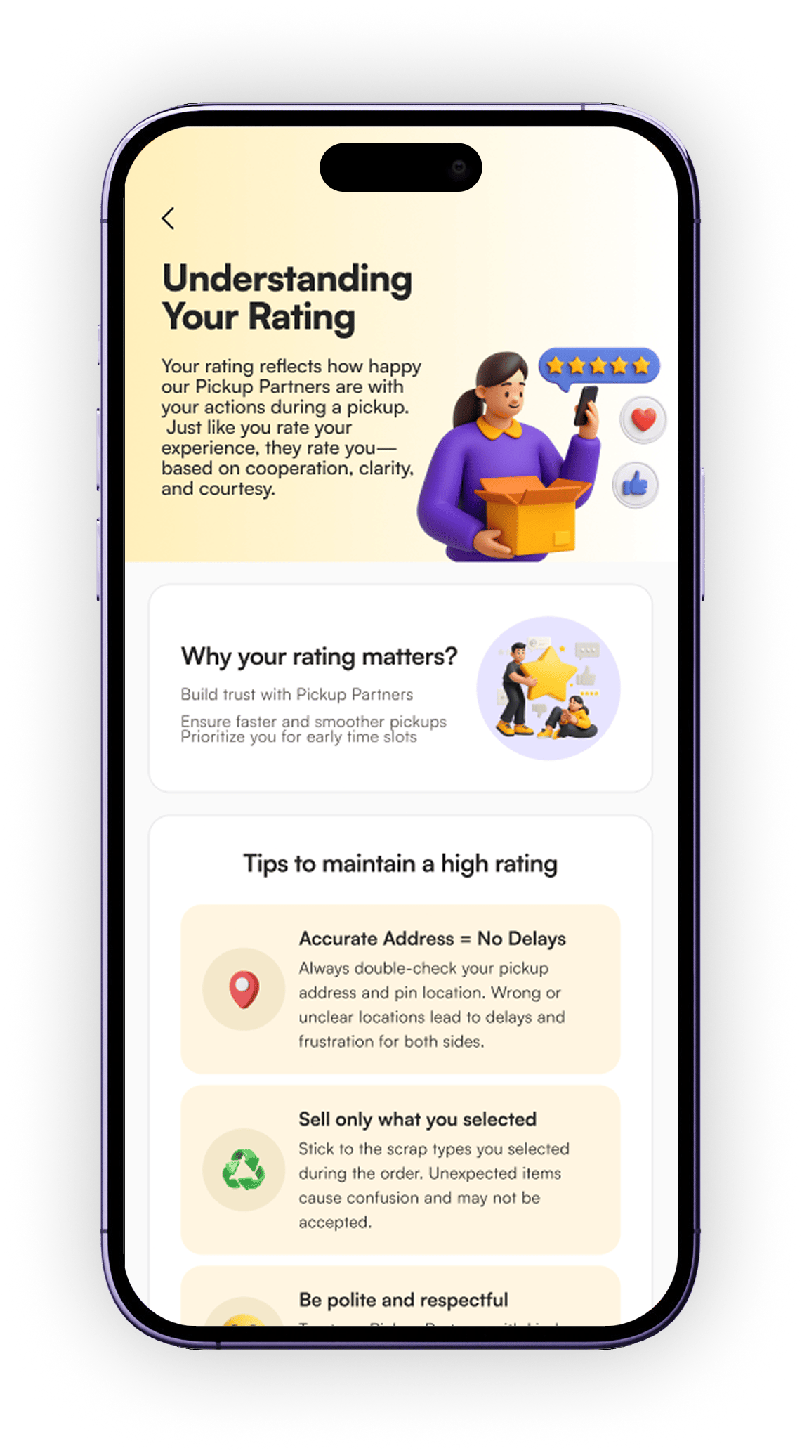
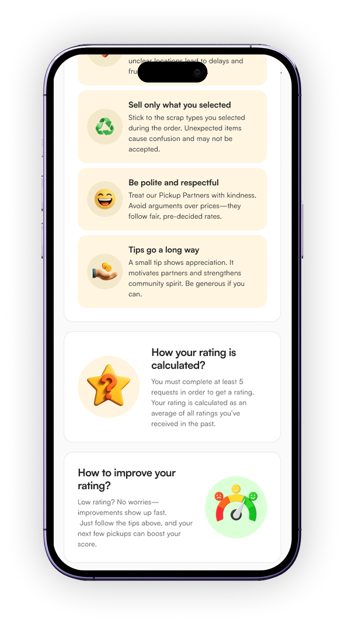
When users know they're being rated too, they naturally become more considerate. The rating system creates a social contract in which both sides of the exchange matter. Users feel responsibility, not surveillance.

Results & Outcomes
The numbers tell the story.
Across 7 design scenarios, the redesign delivered measurable impact in conversion, quality, and engagement — all under tight timelines.
19.4%
Homepage drop-off rate after redesign (within 1 month)
98%
Reduction in false/wrong material bookings
7
Major UX problems solved end-to-end
Full
UI system rebuilt from scratch with new design language
Want to see the full designs?
This case study covers the research, rationale and outcomes. The actual screens, prototypes and design system are available on request. Let's talk.
Get in Touch →

Hello there! I'm Harsh Pushpkar, from Bhopal. I’m someone who enjoys figuring out how things work and making them simpler and more meaningful for people. I like exploring ideas, whether it’s through design, tech, or building something from scratch. Outside of work, I’m always curious, learning, and trying to create things that feel both useful and thoughtful.

Currently Working as a designer at Swaayatt Robots - Designing Interfaces for Autonomous and ADAS Software Applications, internal dashboards, automotive graphic.

Copyright@ 2026 Harsh Pushpkar. All rights reserved.